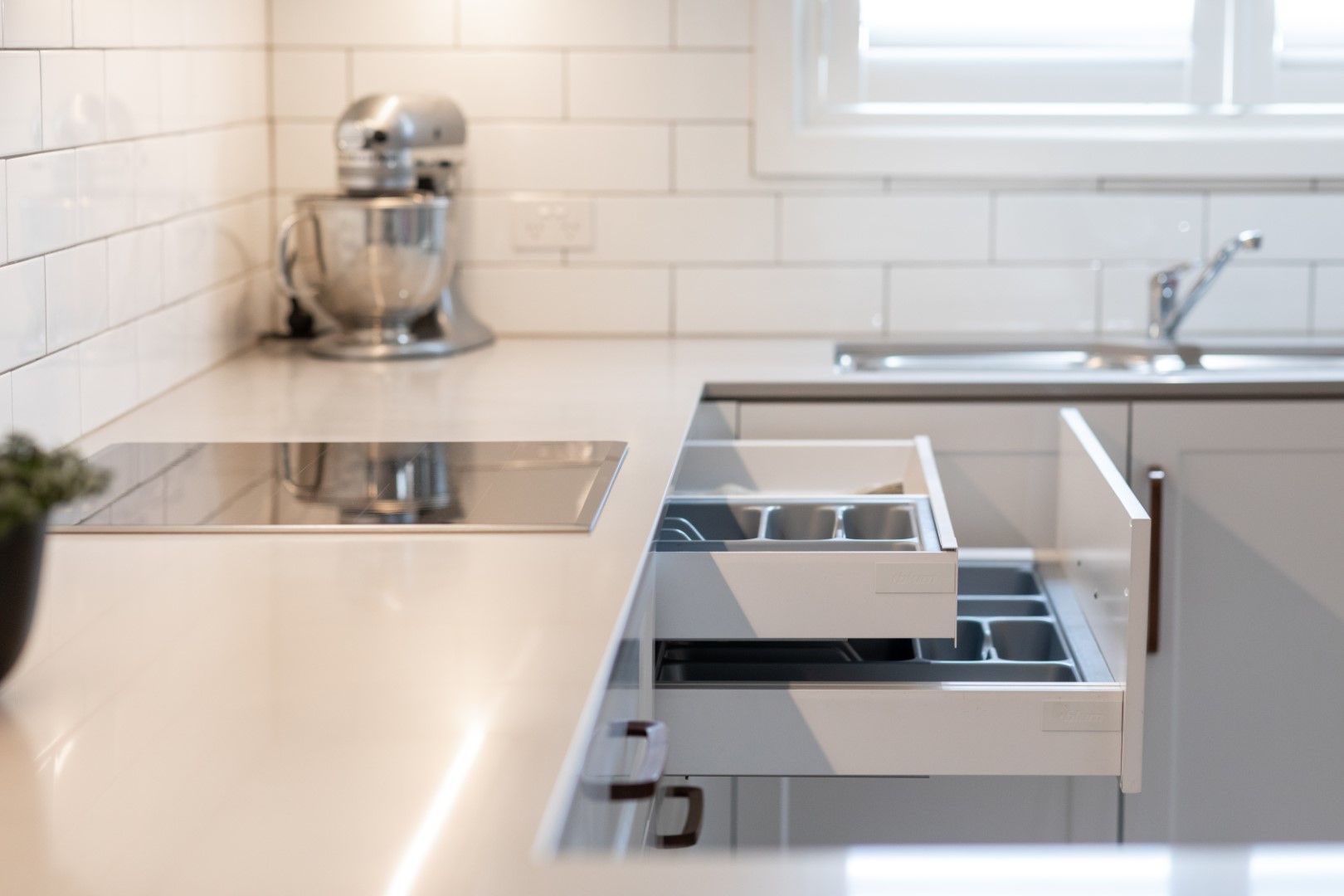
The challenge is to create more out of less and to create smart storage solutions, where you can stow away as much as possible, to keep your working surface clear of clutter. Two Bedroom units often lack storage space in general, which can be a challenge.
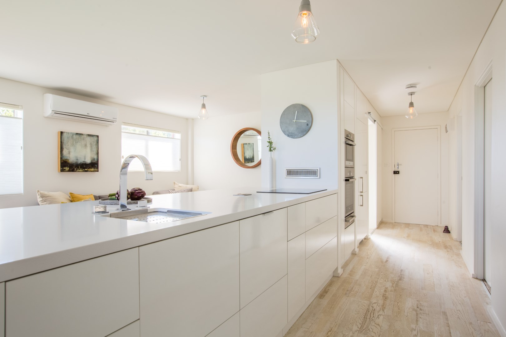
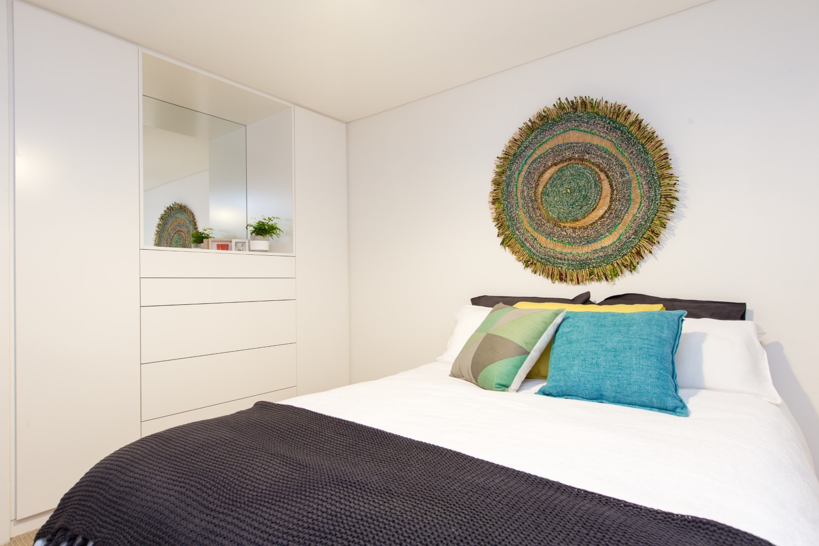
In both of these Unit projects, the cabinetry is oversized and modern to create a clean, seamless look in a some-what small space. Large pot drawers were used for efficient storage, as they can accommodate up to a third more than cupboards can and by keeping the palette restrained or of a similar colour to the interior walls, maintains an uninterrupted visual flow, making the spaces again feel bigger.
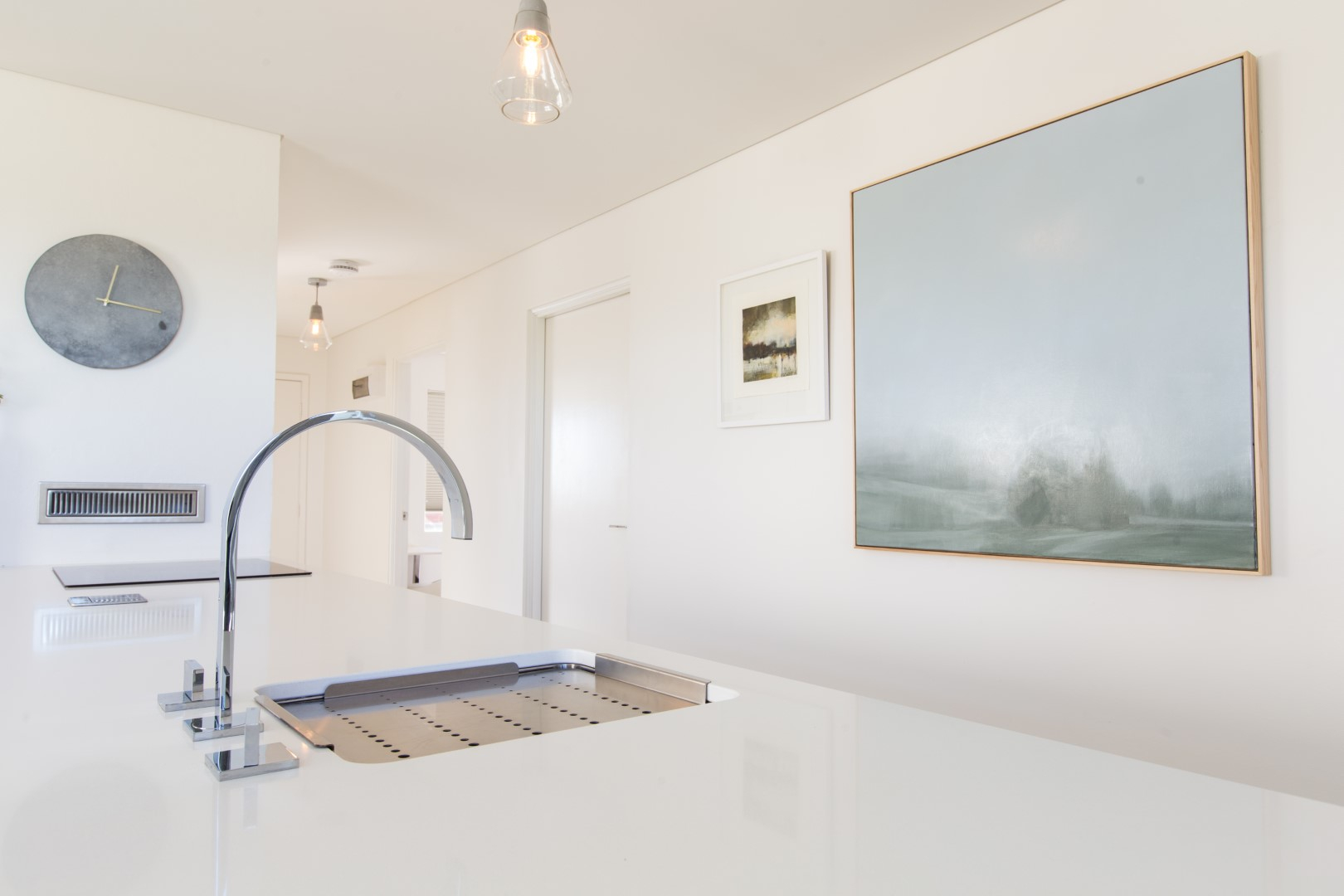
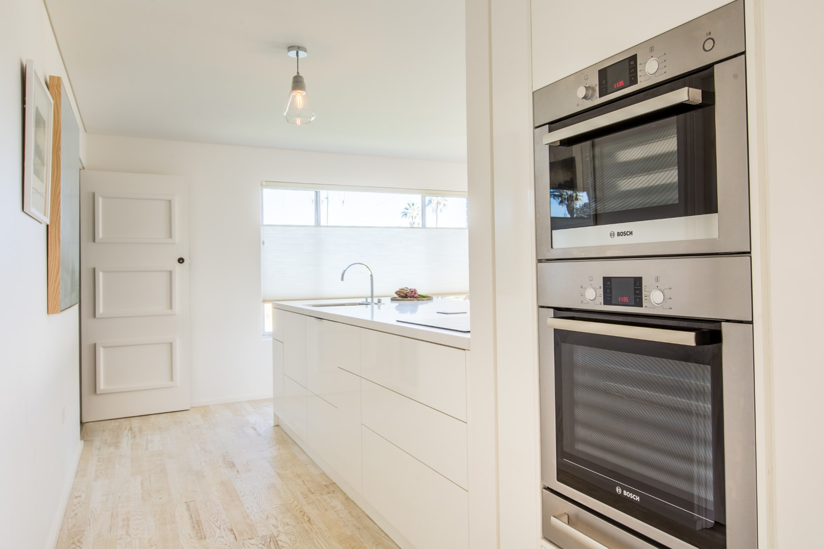
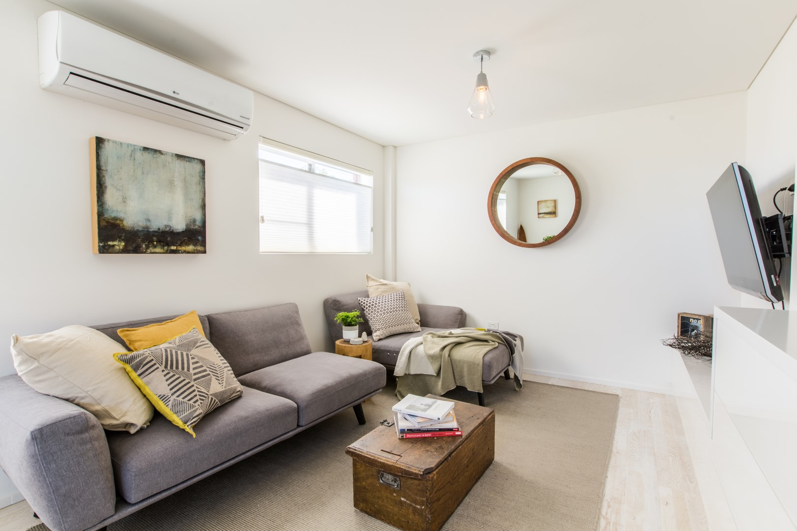
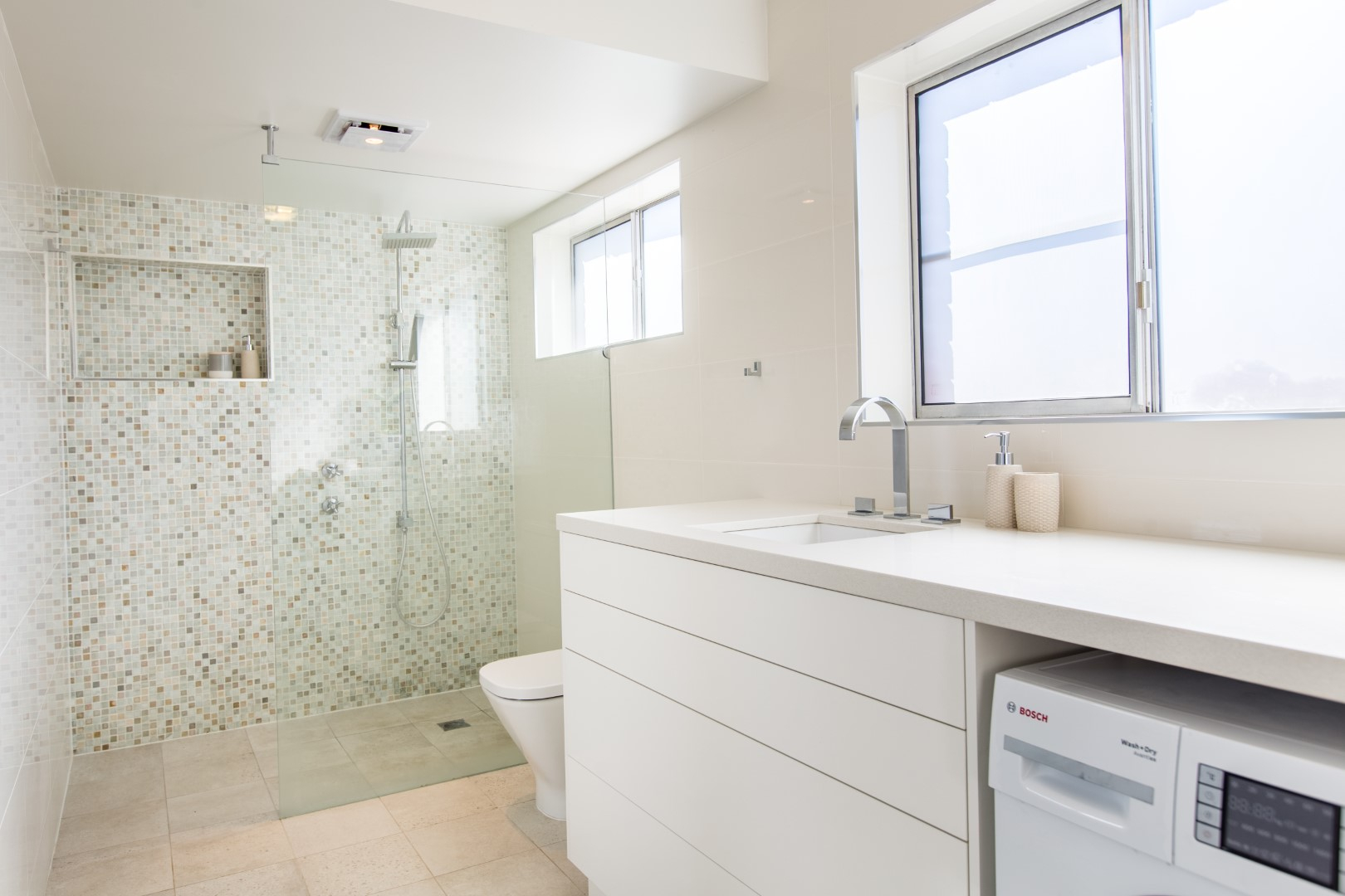
Positioning the kitchen in the hallway of Unit 1, utilises an otherwise unused space and creates a kitchen working area, keeping cooking and prepping separate from socialising and dining. By extending the kitchen into the hallway, it gives that enhanced illusion of the kitchen and the whole floorplan being bigger than it is. To complement this overall ultra-clean, sleek appearance of the Unit, the joinery was kept minimalistic with integrated push drawers, under-mounted sink and integrated Dishwasher and Fridge. This look was carried through to the TV storage unit, combined laundry and vanity and the built-in Robe.
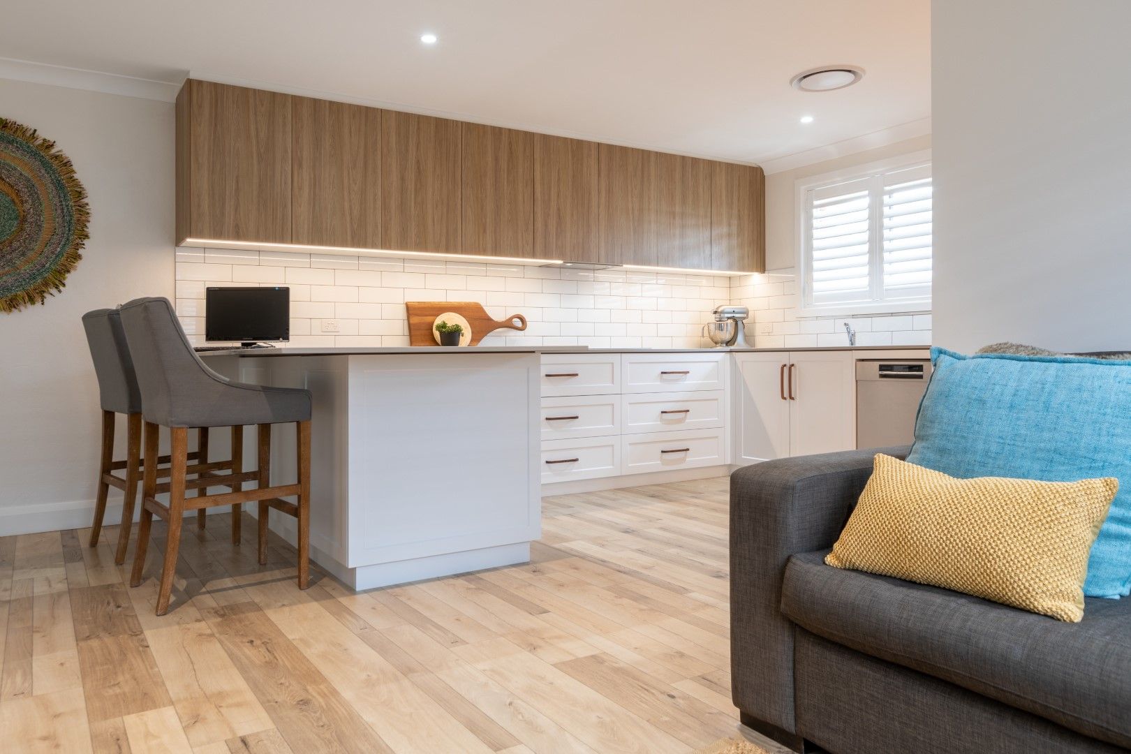
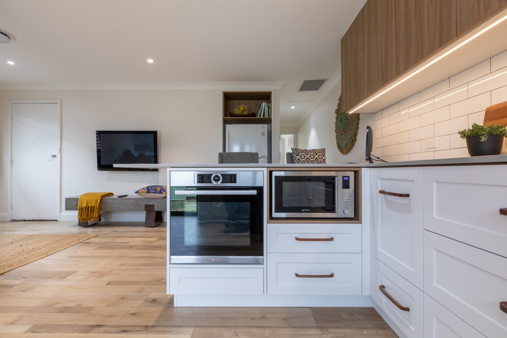
Unit 2 offers an L Shaped layout, which incorporates an oversized dining table into the return bench and deep storage in the corner. The horizontal lines of the drawers also trick the eye into thinking the space is longer than it is. The Polytec Prime Oak Woodmatt overhead cabinetry runs to the ceiling creating a textural feature, whilst it also connects with the timber floor. A classic shaker profile on the base cabinetry was selected and handles were considered more practical for this young family.
Colour Consultant Redchair Interiors
